

.jpg?width=300&name=ux-indonesia-8mikJ83LmSQ-unsplash%20(1).jpg)
Visualizations aren’t just pie graphs and histograms, they build trust with your audience and share valuable insights. These insights will be used to make decisions and help your analytics speak to your audience.
Lights, Camera, Data Visualization
In theatre, the audience only sees the final performance. They don’t see the hours spent in auditions, scripting, rehearsing, and preparing costume and set designs. In analytics, the audience only sees the visualizations. They don’t see the hours spent in obtaining data, cleaning, transforming and preparing the coordinated visualizations. In both, there is a perfectly curated story to tell. Here are three best practices that will help your analytics resonate with your audience.
Collaboration
Unlike theatre, your audience may know more about the data than you do. It’s like performing to a group that already read the book. Their “tribal knowledge” or “experienced intuition” has to be pieced together to obtain the true picture of the data. There is character development that is essential to cleaning and transforming the raw values. It's smart to meet with the stakeholders closest to the business process. During these meetings, don’t make any assumptions about the data. Showing the team the data and asking for feedback is an essential part of the process.
What does that look like in application? Let's say we share a map of customer density by state. The business may point out that customers had been self-reporting this information and entering the first location in the dropdown instead of reporting their actual location. This isn’t something we could have known from reviewing the data and so with that valuable insight we may decide to join an additional data source to bring in this information.
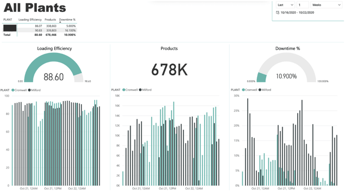
Documentation
When you walk into the theater you’re usually handed a playbill so the audience knows who is performing. The first question that often comes up when showing a visualization is where the data comes from. When preparing a dashboard for a meeting, it's a good idea to describe:
- Data source(s)
- Filtering and cleaning
- New column definitions (especially those created with formulas)
Additionally, on each visualization it's a good practice to add labels, titles, and a detailed legend. There may even be a note to add of something peculiar or interesting and an opportunity to get feedback from the audience. These cues help track details to review later.
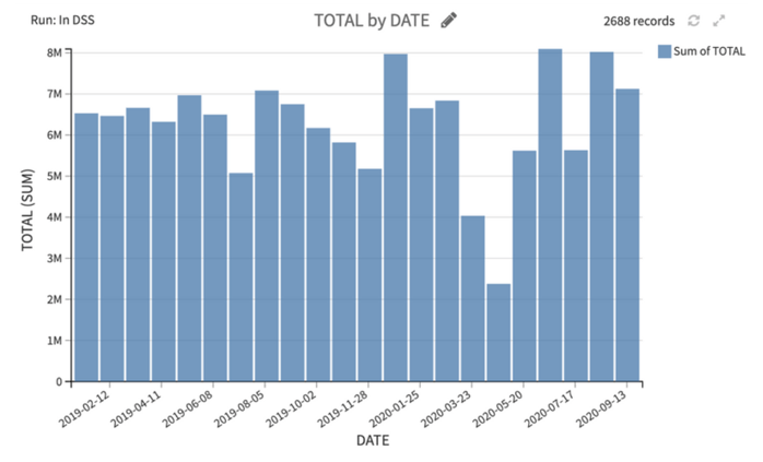
For example, the following visual doesn’t provide any measurement for total on the axis or in the title. The date is ambiguous. Is this describing the run date? Order date? Ship date? Invoice date? Requested delivery date?
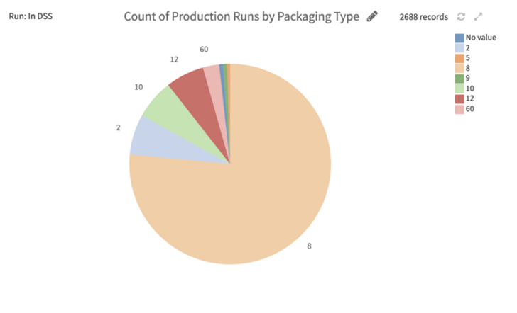
 The following visual identifies the most common packaging type, but not the definition of that type. Additionally, the business may identify some of these packaging types need to be grouped.
 Align with Business Value
Every scene in a performance should support the storyline or plot. Every visual you share should tie to a business question or provide an actionable insight. By knowing your audience, you can prepare visualizations that clearly answer their questions. They may ask you for information on sales, but they may actually want to know how to make more sales. You may show them information on their current customers, but they may want to understand how to retain them.
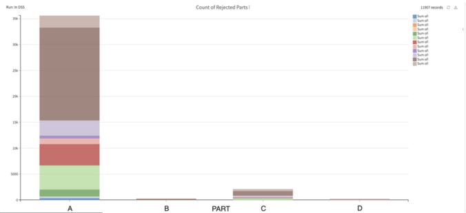
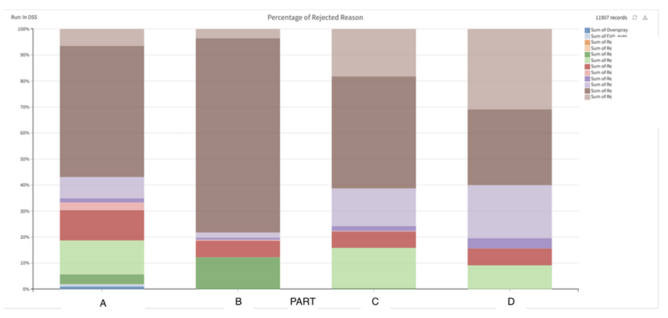
Perhaps a business wants to understand why a part is rejected from the manufacturing line. The following graphs are the same data, just shown differently.
This first graph first answers “What is the count of reject reasons by part?” Count is on the Y-axis and Part is on the X-axis. The colors represent different reject reasons. Because there are so few defects on parts B and C it is hard to see the reject reasons.
This second graph answers “What is the most common reject reason by part?” The Y-axis is the percentage of rejects and Part is on the X-axis. The colors represent different reject reasons. The audience can better understand the difference in reject reasons by part.
Denouement
The denouement is the final scene of the play, when everything comes together and the situation is resolved. The audience walks away feeling satisfied with the outcomes. In the same way, you can empower your audience with visualizations that lead to ongoing insights and business decisions. What information will they need to continue monitoring? How can this data be displayed so it is easy to understand and apply? How can you use visuals to provide early warnings or alerts?
For example, providing a way to compare sales by locations and plants allows the business to identify those that are doing above average. Learning from these teams will provide value to the rest of the organization.
Lights, Camera, Data in Action
By following the best practices of using visualizations, your audience will be begging for an encore! Check out our resources page for more best practices and insights.