

.jpg?width=300&name=Blank-Template-Website-Headers%20(1).jpg)
Forecasting and predictive analytics are often one of the main reasons companies want to incorporate data science into their business. However, the complexity of forecasting algorithms and data models leaves many companies falling short of achieving the full benefit of these practices. Fortunately, using the right tools makes it possible for companies to leverage the valuable insights hidden in their historical time series data.
Applying Predictive Analysis in Business
Many businesses crave the power of forecasting and predictive analysis. It is certainly an eye-opening and actionable tool that can be used to support a variety of departments within an organization. Forecasting models can be applied to many use cases including projecting revenue or sales for the next quarter, anticipating the number of products needed for a busy holiday season, or planning for future downtime on a machine's maintenance schedule. These predictions allow companies to gain the insights needed to plan efficient use of their resources and identify trends that are likely to impact their business.
Getting Started: Dataiku’s Visual ML Time Series Forecasting Model
Dataiku’s visual ML feature simplifies the time series forecasting process for both technical and non-technical users into a few simple and manageable steps.
Whether you are a seasoned professional or a new and eager beginner, by the end of this guide you will understand the data requirements, preparation techniques, and processes necessary to forecast a projected outcome over a period of time using Dataiku.
Gathering Your Datasets
In order to effectively perform Time Series Analysis using Dataiku’s forecasting model you will need a dataset containing these three data variables:
- A numerical feature
- A date feature (both “meaning” and “storage” types need to be set to “date”)
- An identifier column that uniquely identifies a specific series of data within the larger dataset (like a part number, stock symbol, etc.)
PRO TIP: Looking to learn, but don’t have a data source of your own? Start here by downloading the example project used in this article and then importing it into your DSS instance as a new project.
Selecting the Criteria
The dataset used here is a set of three tables from a retail store in Latin America. The analysis will look at the sales transactions per day for each store in the set and aim to forecast the store’s future sales.
Getting started with a visual forecasting analysis in Dataiku is as simple as selecting the dataset to work with and clicking the Lab button in the “Actions” setting. Then click on Time Series Forecasting in the “Visual ML” menu.
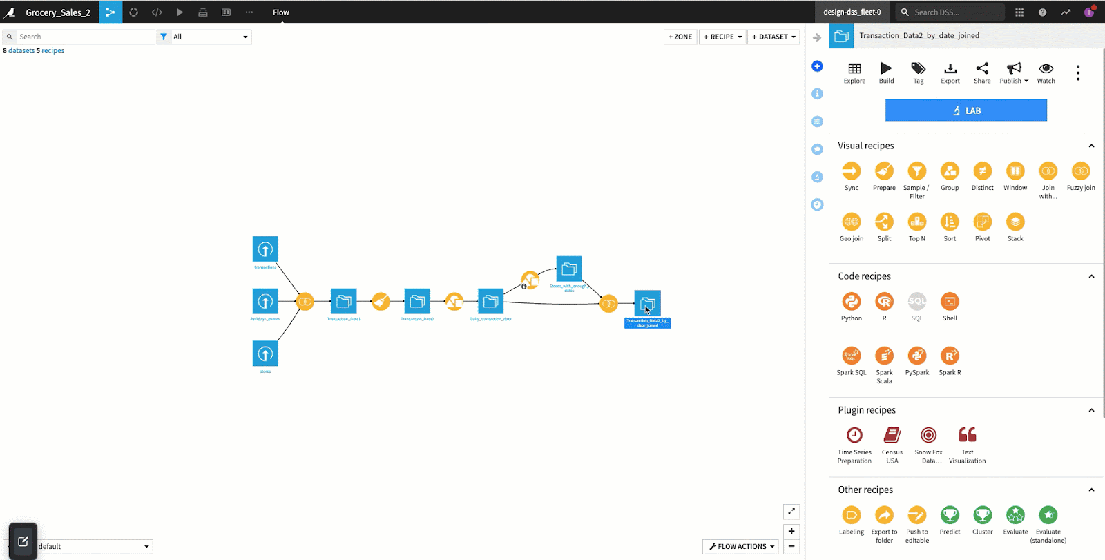
From there you select the feature to predict. If there are multiple groupings within the data (individual stores for this example), we can select the unique identifier column as mentioned above. In today’s example, we will be using transaction as the numerical feature, date as the date feature, and store_number as the identifier column.
In the “Algorithm presets” you can select “Quick Prototypes”, “Statistical Models”, or “Deep Learning Models”. These presets determine which types of algorithms and hyperparameters Dataiku will suggest to produce the best results. Here we will be using the “Quick Prototypes” preset and select the CREATE button in the bottom right corner.

Choosing the Time Series Forecasting Settings
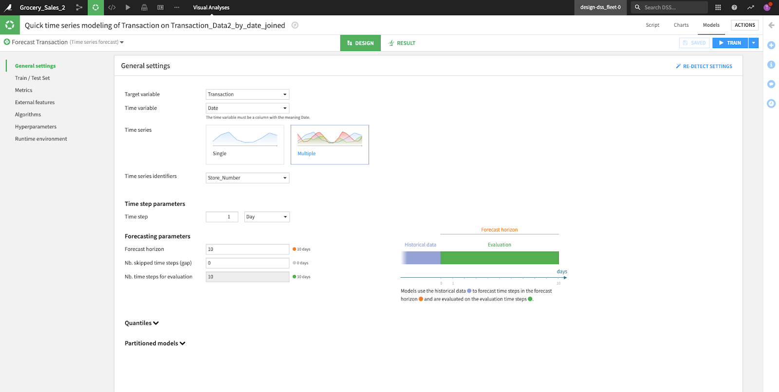
After your selection, Dataiku will take you to the “Design” tab in the “Visual Analysis” screen. It is within this tab that we can modify the model training presets that Dataiku has pre-configured for us. Next, we review the following options: General Settings, Train / Test Set, Metrics, External Features, Algorithms, Hyperparameters, and Runtime Environment. External Features are another powerful topic in Dataiku forecasting that will be touched upon in a future post.
The screenshots shown below are reflective of the preset suggestions made by Dataiku based on our transactional sales data.
General Settings
- Shown first are the base settings as listed in the previous step (target and time variables with identifiers)
- The “Time step parameter” defines the granularity of the data to be forecasted. For example, if we have a very detailed dataset containing time series data every second, our goal may be to project minutes into the future, but if we are hoping to predict seasonal sales trends, our time step might be days, weeks, or months.
- In the “Forecasting parameters” section, we specify the number of “Time step parameters” (above) that we’d like to forecast and evaluate our model on. For example, if we had specified days as a time step, then we might specify 14 as a “Forecast horizon” in this section to forecast the next two weeks (14 days) of data.
- “Partitioned Models” this feature has the capability to allow partitioned models on partitioned datasets. This feature is still in the experimental phase within Dataiku so based on the model support could be limited.
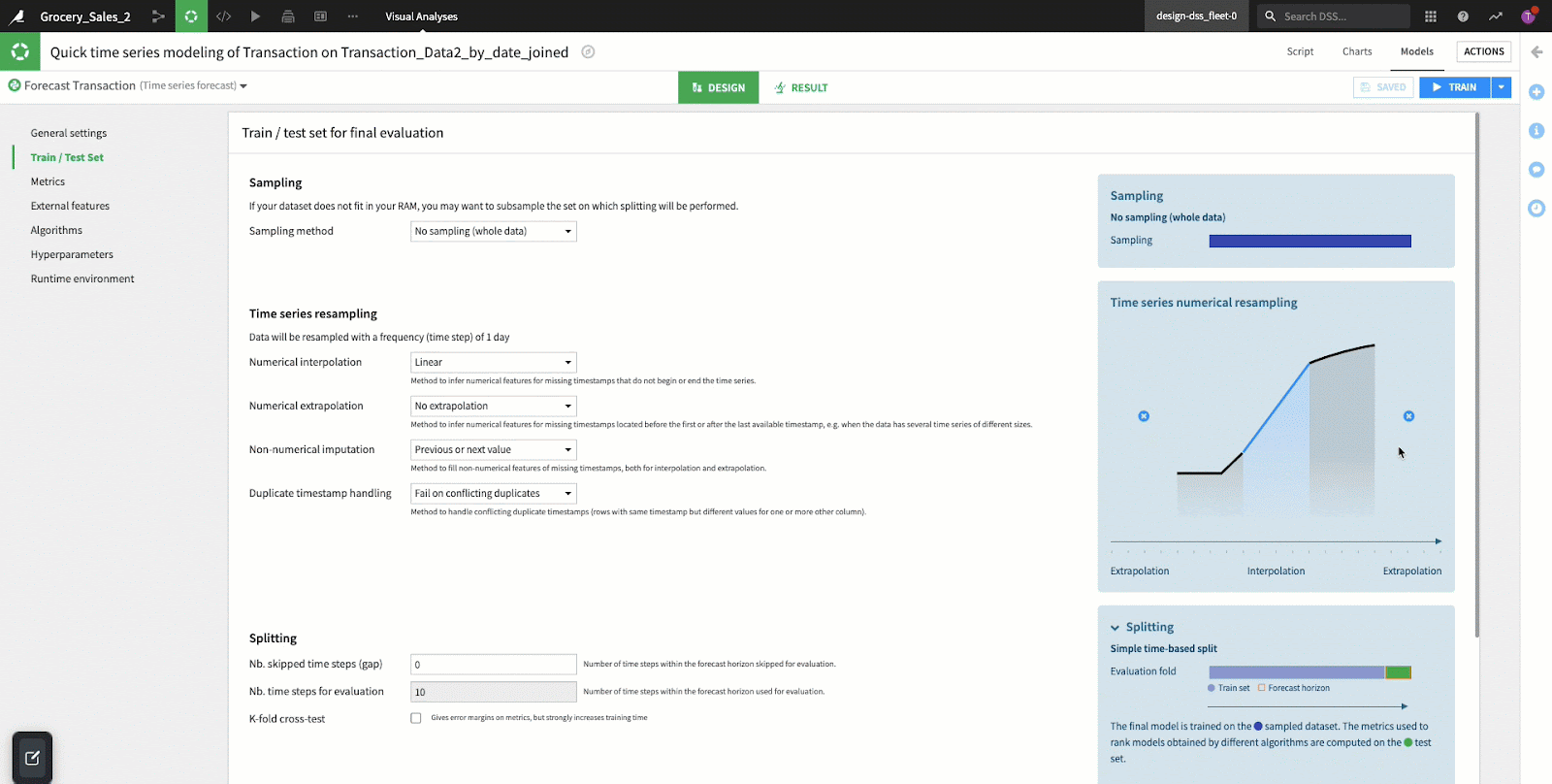
This section configures Dataiku to prepare datasets for the training and testing of our forecasting model. Generally in any machine learning effort, we need to create a “train” set to teach our model on historical data and a “test” set for the model to validate its results. The sections below make it easy to create these datasets, handling some of the common time series data preparation challenges.
- Sampling: Dataiku by default uses the first 100,000 rows of the dataset (our example has less than this, so we will use the entire dataset). If you are working with a much larger set of data, it may be more appropriate to do a random (or another type) of sample to reduce the model training time.
- Time Series Resampling: When implementing a forecasting model, equally positioned time steps are essential. Our data may not always be sampled/collected in a consistent manner, so the function of “resampling” is often performed to create consistent intervals out of inconsistent data. Dataiku makes these resampling efforts very easy with a few options provided in this section of the user interface:
- Interpolation
- Used when DateTime variables are missing in the middle of a time series dataset. Inter means “in-between” and is used when you want to determine a new value between two known existing values. The two most commonly used interpolation methods are linear and polynomial, which is identified by the curvature of the line in a graph. Generally, if the line is straight we apply linear and if it is curved we apply polynomials.
- In regards to our example, interpolation is used to estimate the number of transactions in a day for a given store number where a day is missing, but the previous and following days are in the dataset. The line in the graph is straight so DSS applies linear interpolation which estimates the missing value by identifying the data point on a straight line.
- Extrapolation
- Applied when DateTime variables are missing at the beginning or end of a time series dataset. Extra refers to “in addition to” and is used when trying to find a value in addition to existing values placing an estimate outside of the dataset. Extrapolation is a key component in forecasting because it makes a prediction in the future based on data from the past. In our example, we will be turning extrapolation off.
- Splitting: Sorted by the time variable DSS splits the dataset into a train and test set. For time series forecasting, the test set is determined by the number of steps in the forecasting horizon, subtracted by the gap step (steps that were skipped). A gap step occurs when dates are missing from a DateTime column; this can occur for things like weekends, holidays, or data integrity issues (missing dates in the column).
The “Metrics” tab shows aggregation methods by metric. For multiple time series datasets, the model will run metrics per grouped time series. For our example we selected Mean Absolute Percentage Error (MAPE), however, you can use any metric in Dataiku's table below that may be more beneficial for your use case. MAPE is a common choice, as it uses absolute values to keep positive and negative errors from offsetting one another and uses relative errors so you can compare forecast accuracy between different time-series models.

Algorithms
In the “Algorithms” section, you’ll see a selection of Dataiku pre-programmed forecasting algorithms for use in specific modeling activities. In this case, we see open-source algorithms specific to time series forecasting. If you remember back to the first step in this article, we chose “Quick Prototypes” as the preset which has resulted in Dataiku pre-selecting the “Simple Feed Forward” and “NPTS” algorithms with a preset range of hyperparameters.
Alternatively, if we had selected “Deep Learning Models” (or we switched the preset at this time), Dataiku would have instead enabled deep learning algorithms to attempt our forecasts. No matter which presets we use to kick off our modeling session, it’s possible to enable, disable, or modify the hyperparameters for future training sessions as we iterate on our model development.
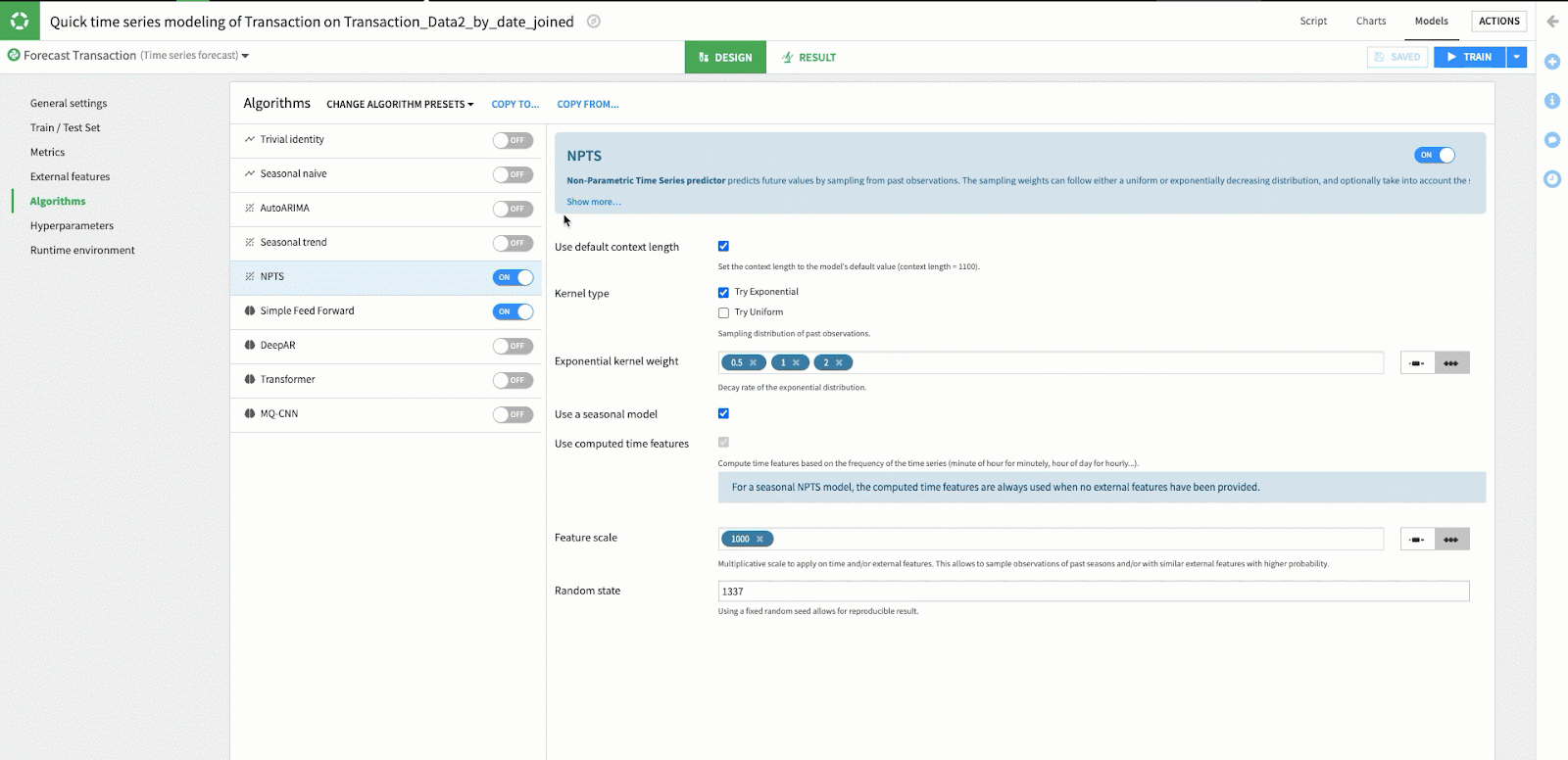
While we are using the defaults for the NPTS and Simple Feed Forward algorithms in this example, it is easy to modify the hyperparameters by selecting one of these algorithms and changing the value in the hyperparameters window. Because of Dataiku's simple user interface you can easily adjust the hyperparameters of your model without requiring any coding knowledge.
With these screens reviewed and configured, we’re ready to click the blue TRAIN button in the upper-right-hand corner of the screen. Depending on your system resources and the configurations chosen, this training process may take anywhere from seconds to hours.
Time Series Forecasting Insights, Scoring, and Results
In time series forecasting, a time variable and target variable are required, but having additional time-dependent features can provide additional insight into your analysis and in many cases improve performance.
Scoring is based on what was stated in the prerequisites for time series analysis: the time column, the identifier column(s), and the target column. The forecast horizon will then be presented in the scoring recipe which is based on the last recorded DateTime model in the sample.

These models show forecast projections for the number of transactions per store over the next 10 days in the orange line graph. The blue line graph titled backtest is the process of testing the accuracy of the forecast method using the previous historical data. The blue and orange area charts highlighting the orange and blue lines are defined in Dataiku as quantiles. Quantiles define a range in which the actual value is likely to fall within a given probability. The black line titled Actual is our four-month recorded historical transactional data.
Expanding the Use of Your Visual ML Tool
The more you use Dataiku’s Time Series Forecasting Visual ML tool to forecast transactional data the more you will see the ways it can be applied to maximize your data practice. You might begin to use this process with a variety of data sources and outputs. Check out this article for more tips on preparing new data sources for this type of analysis in Dataiku.
| FEATURED AUTHOR: TREVOR CRAIG, DATA SCIENTIST
-1.png?width=290&name=Blank-Template-Facebook-Post%20(2)-1.png)