

Map visuals can be a powerful way to communicate important information. Layering public geographic data alongside business data can provide additional eye-opening (and actionable) insights. For example, what if you wanted to create AI software to monitor traffic cameras during rush hour and reroute your vehicles to save on shipping costs? Getting real-time or near real-time data can be incredibly beneficial in day-to-day operations like this.
With the advent of IoT devices, our ability to collect accurate data for analysis is more prevalent than ever. As more organizations continue to develop their own data collection and analysis tools, some even make their datasets available for use.
There are several ways to use these datasets depending on your application; a few of which we will go through today. In this example, we use an interesting dataset from Montgomery, Maryland that includes detailed information about certain police events accessible to the public.
Analyzing Public Data
First, let’s look at the relationship between specific pieces of data. For example, here we will review incidents that involve traffic stops (speeding, accidents, etc.) and incidents that involve a pedestrian being struck by a vehicle. The dataset used is from 2018 through April 2023.
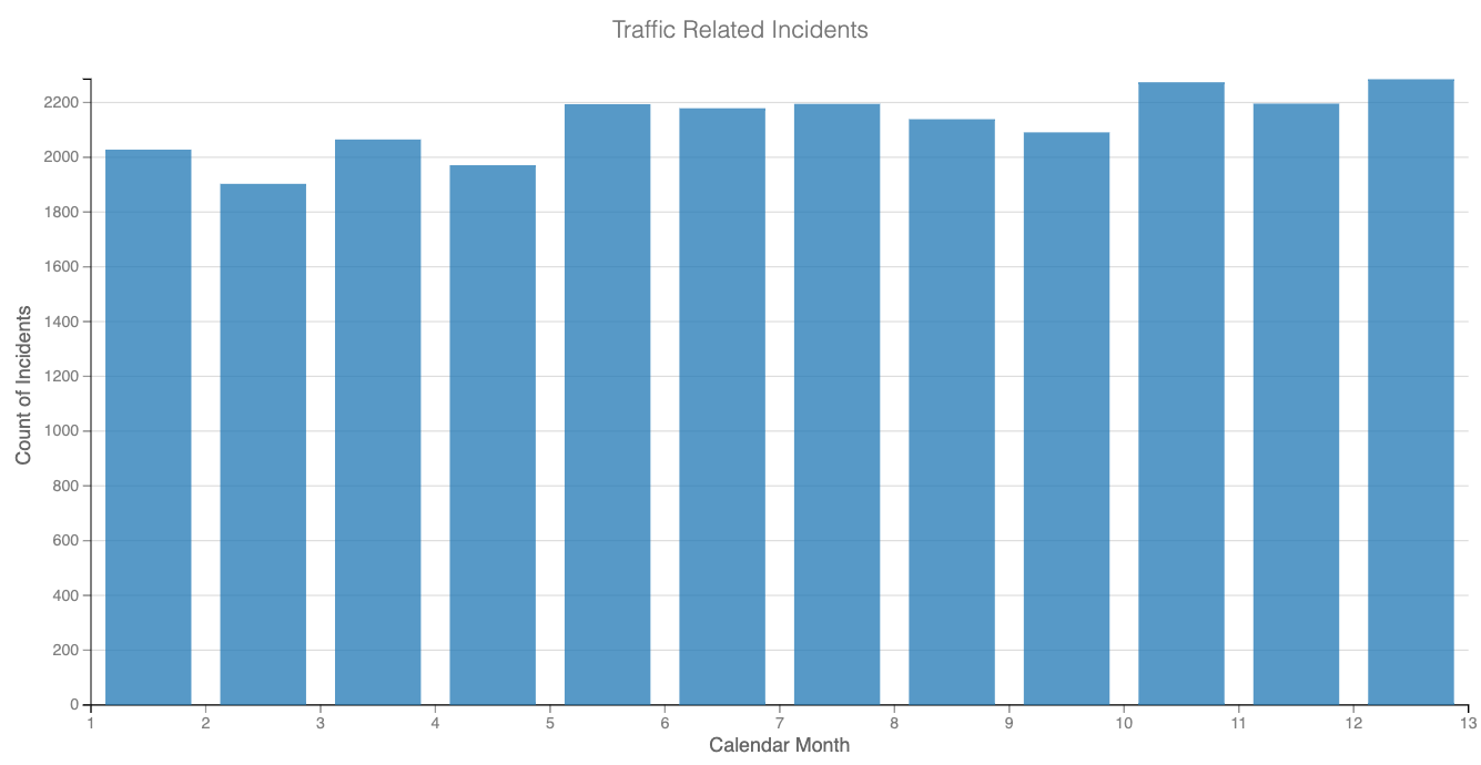
The visual examples below are limited to the year 2022. The blue bar chart listed first shows traffic-related incidents by month during 2022. We analyze this information against the second bar chart in red, which shows incidents related to pedestrians struck by vehicles by month during 2022.
Reviewing data related to traffic incidents, we see a corresponding increase in traffic violations in the summer months (May-August). We also identify a potential connection between more traffic (possibly from tourism) and an increased risk of being hit by a car. Of course, a more thorough analysis would be required to identify the relationship between traffic incidents and pedestrians being struck by a vehicle, but you can begin to see already how various pieces of the data start to lay the breadcrumbs of a story.
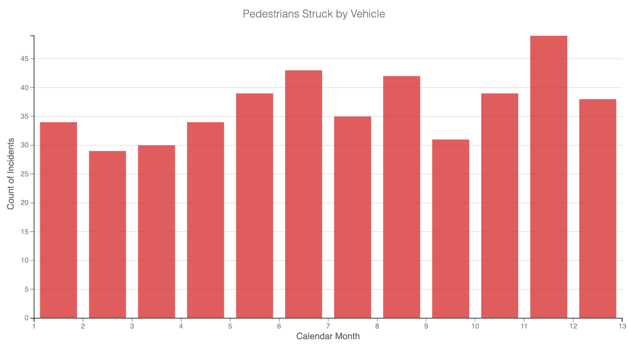
Another interesting observation is that the number of incidents related to pedestrians being struck by a vehicle appears to trend upward in spring, presumably when weather conditions are better for venturing outdoors. We notice a drop in July and September, with a spike in November. We could look further to see if there are local fall festivals or Thanksgiving travel (the most traveled holiday in the country) that could be contributing to the data we are seeing. The Dataiku scatter map below of Montgomery County, MD, represents traffic-related incidents (blue dots) and pedestrians stuck by a vehicle in 2022 (red dots).
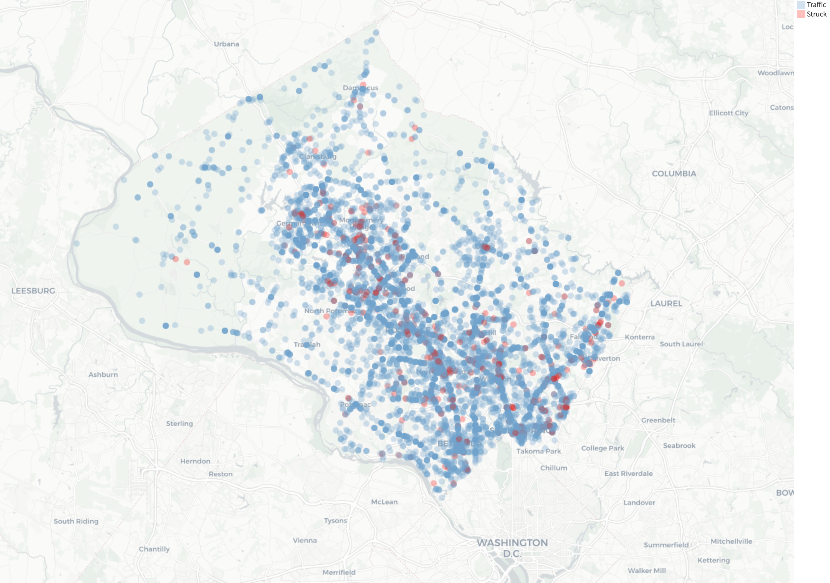
While bar graphs provide a lot of context, sometimes a map can speak volumes. This mapping feature is an out-of-the-box tool in Dataiku and is easy to use. Continuing to look at 2022, below is a map representing the location of each incident in the county. The red dots represent pedestrians struck by a vehicle. If you were to zoom in, these dots tend to group around main roads and highways where increased traffic leads to increased traffic violations and a higher likelihood of hitting a pedestrian walking alongside the road or passing through a crosswalk.
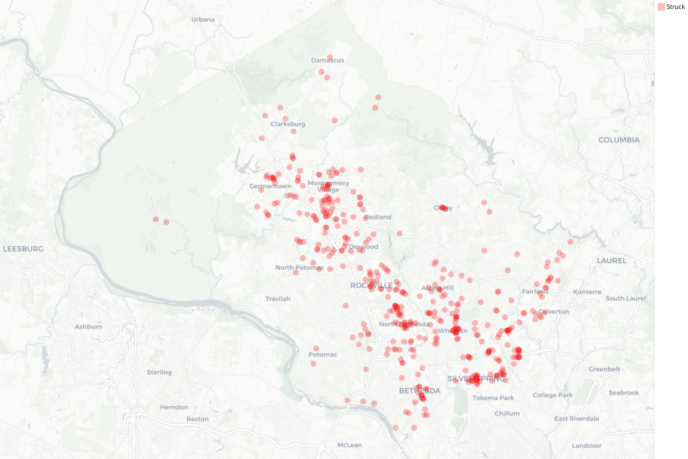 When we remove the traffic-related incidents and only look at the pedestrian-related incidents, we get visibility into the clustering a little more. Notice how there are little pockets or clusters? These tend to occur in more populated areas of the county and at high-traffic intersections.
The below Dataiku Administrative Map uses the visual aggregation feature to view the data at the city level. The data visualized below represents pedestrians struck by a vehicle in 2022.
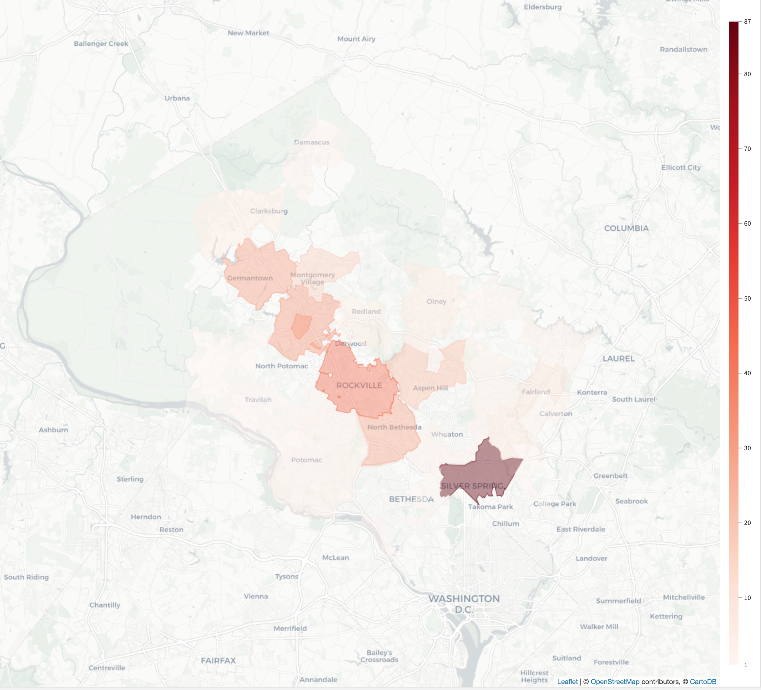 This visual helps align the scattered dots in other visuals to the counties for each state. Dataiku makes it easy to switch between various “zoom” levels. If we had a larger dataset and wanted to view by state or even country, that can easily be done by changing one setting for the visual.
Another great way to visualize data on a map is by using different data in combination with each other to show the magnitude of impact. In the next image, we are looking at incidents where pedestrians are struck by a vehicle over a series of time (2018-2022), and the size of each dot is related to the priority of the call. The larger the bubble, the higher the priority for police response likely because the incident was more severe than others. In the Dataiku scatter map below, the red dots represent pedestrians struck by a vehicle. The different color bubbles represent the calendar year (2018-2022) and the size represents the priority of the dispatch call on a scale of 0 (low) to 3 (high).
.png?width=2580&height=1706&name=Photo%2010%20(1).png)
Examples of Using Public Datasets in Map Visuals
You can also use public information alongside your company’s private data. When looking at route optimization for deliveries, maybe it makes sense to avoid areas where traffic accidents and pedestrian incidents are high. This not only reduces the liability related to deliveries but also can improve on-time delivery because accidents are notoriously good at creating congestion on roadways. To further enhance route optimization, you may be able to factor in the historical and current weather conditions. If a storm front is coming through during tornado season, it may be better to hold trucks back or re-route them. The same is possible with winter storms and snowfall, or worse, icy conditions.
Consider if you are a marketing agency hired by a law firm. It would also be possible to attract new clients for the firm if your billboards were placed in areas with the highest concentration of incidents. Similar examples can be found if you are attempting to market bicycles as an alternative to cars and the placement of advertisements in high-congestion areas where bicycle trails or lanes are more commonly found.
Publicly Available Datasets
Not sure where to begin with your public dataset analysis? Below are some datasets available to the public that are worthy of exploring. Many of these are updated regularly providing the ability for continuous analysis rather than incremental each week, month, or year.
Legislation:
OPEN Government Data Act - https://data.gov/open-gov/
City / State:
New York City Open Data - https://opendata.cityofnewyork.us/
Washington DC Open Data - https://opendata.dc.gov/
State of Virginia Data - https://data.virginia.gov/
Weather & Satellite:
NOAA Oceanic data & forecast - https://registry.opendata.aws/noaa-rtofs/
USGS - https://waterservices.usgs.gov/
USGS Landsat - https://registry.opendata.aws/usgs-landsat/
Sentinel-2 - https://registry.opendata.aws/sentinel-2/
Better Data Visualizations and Meaningful Insights
The future of data sharing is exciting and we are only seeing the beginning. Today, devices are trying to capture as much metadata as possible to better understand their users and build better or more customized products and services. Geo-location data is a growing opportunity for data scientists and analysts to find new ways to enhance their own data visuals and create presentations with meaningful insights.
Want to learn more about visualization best practices? Check out our blog on best practices for data visualizations in manufacturing.
| FEATURED AUTHOR: PARKER LENZ, SENIOR DATA CONSULTANT
-1.png?width=290&name=Blank-Template-Facebook-Post%20(2)-1.png)