

.jpg?width=300&name=Blank-Template-Blog-Graphics-Header%20(3).jpg)
Many times the people in the best position to see the untapped possibilities of data are the subject matter experts in the business who are already generating reports and insights for their organizations. These amazing analysts are usually ninjas in Excel but don't have the tools to easily create efficiencies like automation and predictive modeling without the use of SQL queries and python code.
What if these users had a tool that required little to no coding and would enable them to create and automate everything from data ingestion to data prep to visualizations to predictive modeling with virtually nothing but point and click? Business Analysts, meet your soulmate: Dataiku!
Putting no-code data science software in the hands of the data domain experts can be a game-changer for organizations by creating numerous efficiencies and consumer- friendly insights. As impressive as the possibilities are, business analysts could find it a little overwhelming to be involved in processes normally handled by coders in IT. In order to help Business Analysts navigate this new paradigm, we’ve created best practices, tips, and options to set them up for success so they can confidently begin to transform raw data into insights without coding knowledge.
Become Familiar With the Most Intuitive and Powerful Visual Recipes
There are five visual recipes that are used most commonly and have a wide variety of uses and applications. These include: join, group, stack, split, and prepare. Becoming familiar with these will allow you to flex between them as needed to get the maximum insights out of your data.
Join
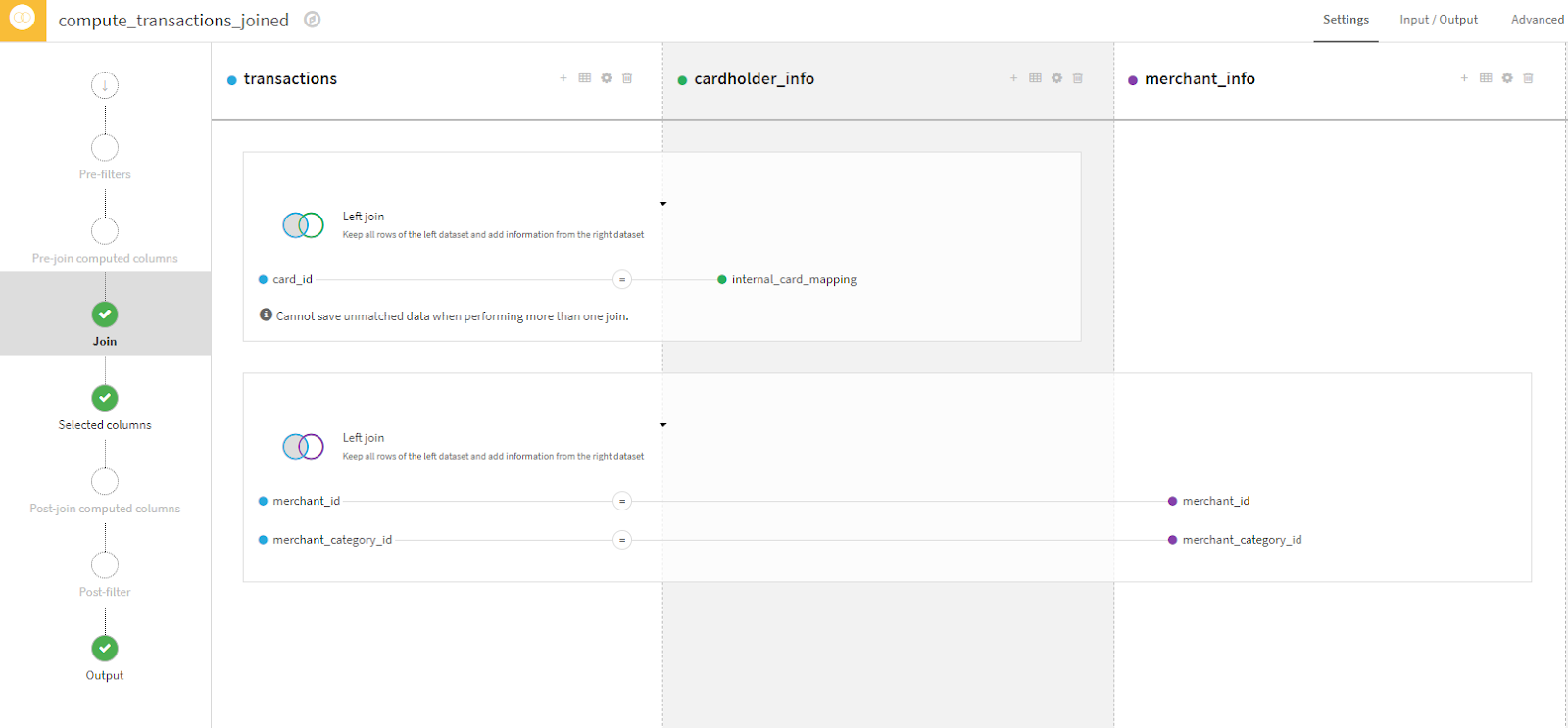
The Join visual recipe allows data from two or more tables to be combined or augmented. This involves adding columns to a dataset. In this example, we start with transactions and add columns from both cardholder_info and merchant_info by matching the key fields that are common between the tables. This is similar to Excel’s VLOOKUP, the business analyst’s best friend! The difference is that Join has a lot more options and can also add rows to datasets. Dataiku offers great documentation, explaining the different types of joins to assist an analyst in selecting the right one.

Group
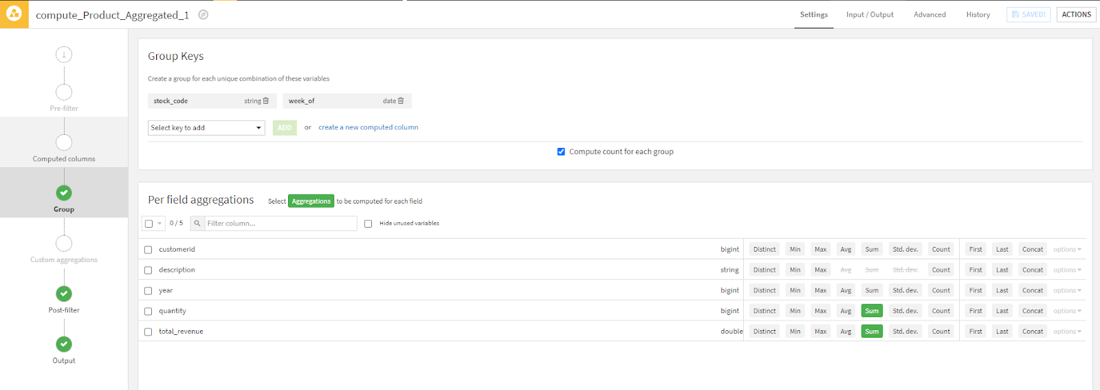
The Group recipe allows for the aggregation (summarization) of data by key columns that the user chooses. Think pivot table in Excel.
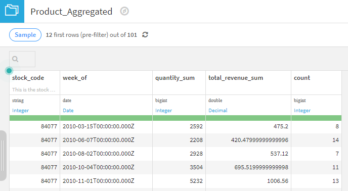
In the example below, we wish to aggregate our retail dataset at the product level. The key elements to a group recipe include "Group Keys" and "Per Field aggregations". This recipe is grouping the data by stock_code and week_of and is creating summary columns for quantity and revenue. Using these results we can view the total quantity and revenue for a particular stock code (84077) by various weeks. Just like a pivot table, right?

Stack
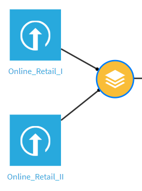
The Stack recipe takes two datasets with similar schemas (columns) and arranges them on top of each other to make one new dataset. In some cases, a business analyst may have similar data coming from multiple sources with slightly different column names but the data represents the same information. This is where Stack shines.
In this example, we are stacking two datasets that have the same underlying data but whose column names don’t exactly match. You can see where Dataiku allows the user to specify which columns match between the datasets and label the output column name as desired.
Split
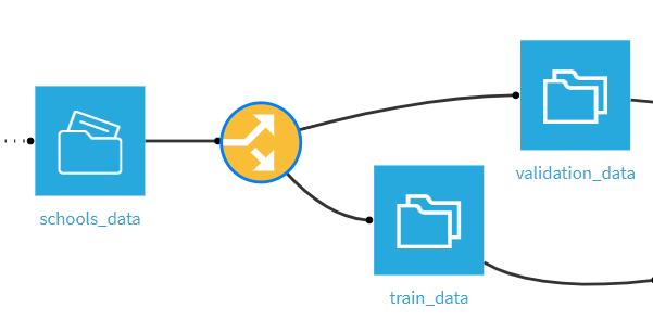
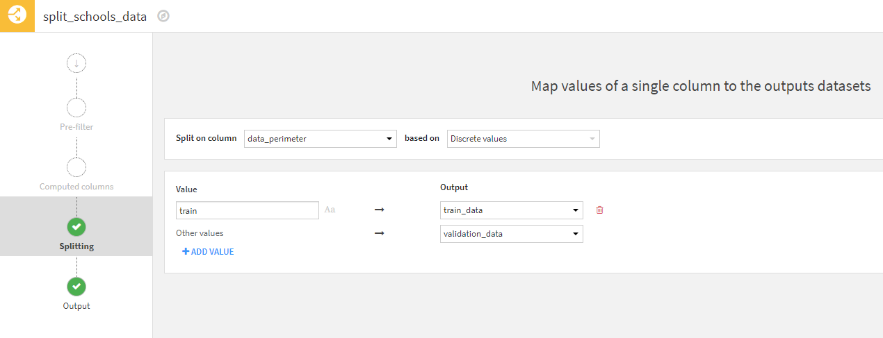
The Split recipe is incredibly helpful when a user simply needs to separate a table into two different datasets using conditional filters based upon values in one or more columns. In this example, we are splitting the schools_data dataset into two tables – one with data for training a model and one with data for validating a model. This is done by splitting the value of the column data_perimeter which contains the values of train or validation.
Prepare
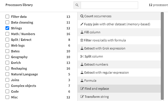
The Prepare recipe contains a library of nearly 100 different processors to filter, clean, enrich, and shape data. Here are just a few that will become the business analyst’s go-to choices.
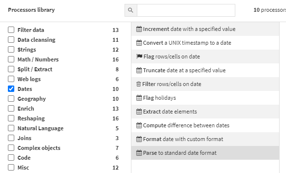
Handling Dates. Dates are notoriously difficult to manage, but Dataiku offers 10 date processors including:
- Extracting date elements such as year, month, week, and day (ex. 1/12/22 is year 2022)
- Calculating the difference between dates in the user’s desired date increment (ex. 14 days between 1/1/22 and 1/15/22)
- Incrementing dates with a specific time period such as the number of days, weeks, etc. (ex. add one year to 3/23/23 to yield 3/23/24)
Preparing Strings. There are 12 processors for manipulating strings, some of our favorites include:
- Filter rows and cells based on specific values
- Find and replace
- Transform string, which includes removing leading and trailing whitespaces.
If you can’t find a processor for the task at hand, the "Formula" process allows you to tap into Dataiku’s formula language to perform if/then statements, min/max formulas, and much more. Business analysts will find this interface very much like building formulas in Excel.
Access Useful Tips and Help Documentation
There are a plethora of useful tips, examples, and resources available to help. You just have to know where to find them! We've gathered some of the best ones here to get you started.
Embedded Tips
Dataiku has an abundance of built-in help right on-screen inside of recipes. Here are two great examples:
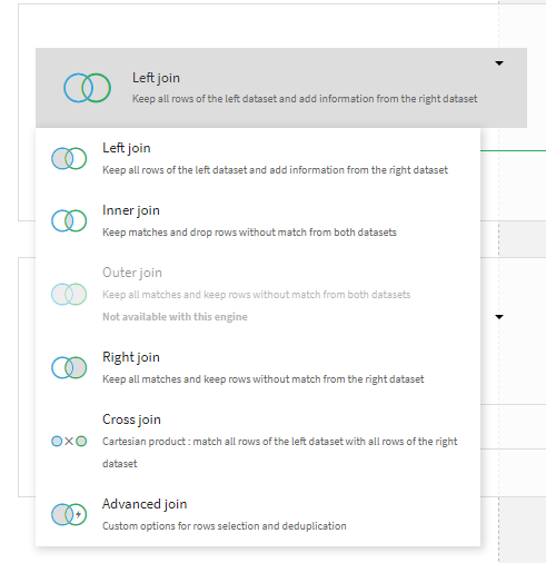
In the Join recipe, one key decision a user must make is what kind of join to perform. This is not something that most business analysts will be familiar with, so it’s incredibly handy that Dataiku explains what each join type represents in plain language.
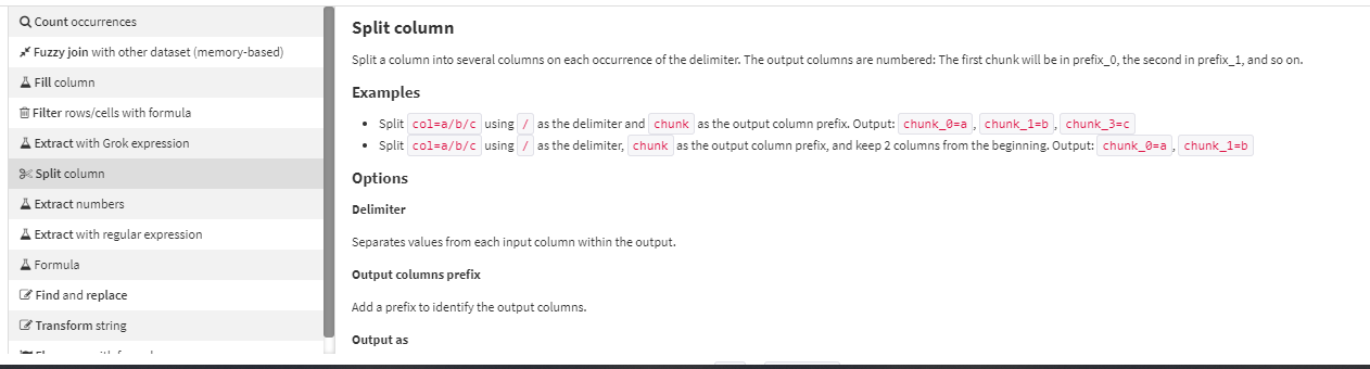
Another example is in the Prepare recipe. Each of the processors has extensive explanations along with examples in the processor selection interface. Below is just a portion of what you see if you are considering using the ‘Split column’ processor and hover-over it while viewing the Processors library. It includes an explanation along with relevant examples.
Online Help and Documentation
Dataiku Knowledge Base is the home for all online resources including product documentation, Dataiku Academy, and Dataiku Community.
Product Documentation is a searchable user guide, offering answers to specific questions and descriptions of functionality.
Dataiku Academy is the source for training courses and certifications.
Dataiku Community is the platform for engaging with other Dataiku users.
Take Advantage of Quick Statistics and Modeling Options
Statistics
One of the quickest and easiest data science tools to use in Dataiku are the statistics cards. These are available under the "Statistics" tab in each dataset. This contains features similar to those in the Excel Data Analysis ToolPak add-in and much more.
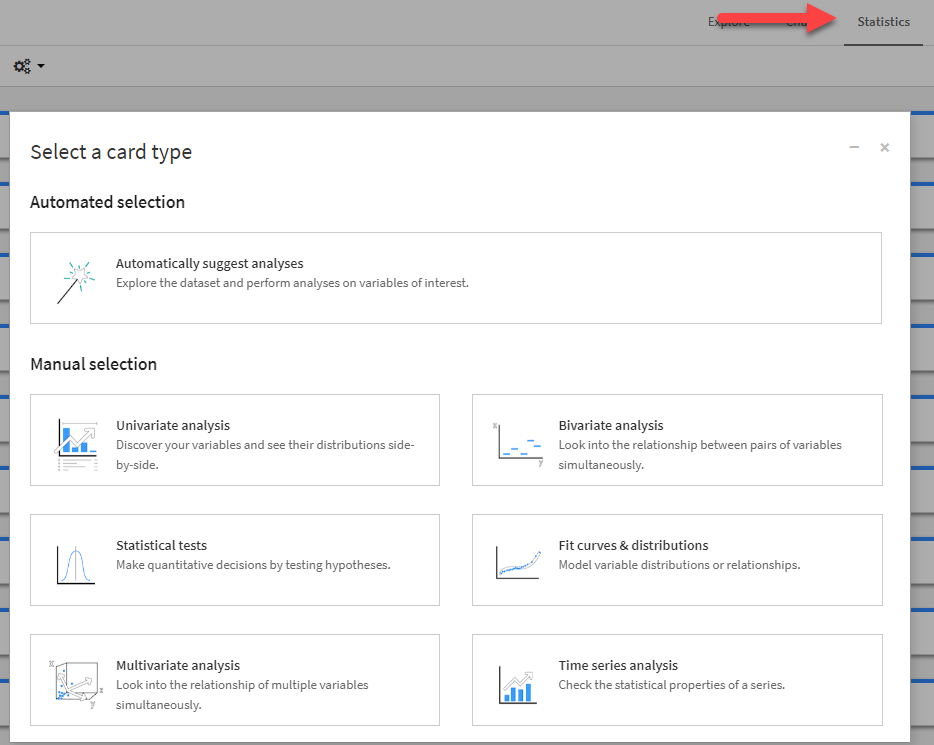
Here users will find:
- Univariate analysis including basic statistics and histograms on individual columns
- Bivariate analysis including scatter plots of two variables in the dataset
- Statistical tests such as ANOVA to compare the means of two columns
- Fit curves & distributions to see if data fits a specific distribution, such as the Normal distribution
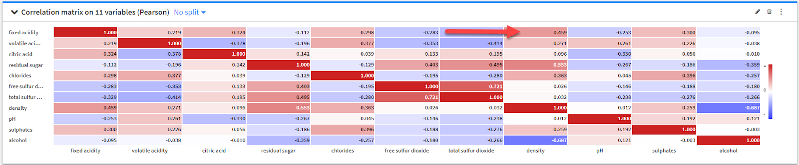
- Multivariate analysis, which includes a correlation matrix that can evaluate up to 99 variables at once
- Time series analysis which allows users to perform tests on stationarity and check for trend prior to performing time series modeling.
Here is one example: A correlation matrix where you can see a positive correlation of 0.459 between fixed acidity and density.
Data Modeling
A business analyst who is accustomed to doing all of their exploration in Excel is limited to the activities of data cleansing, pivoting, and basic statistical and regression analysis. In Dataiku, they can also take advantage of the built-in data modeling capabilities found in the Visual Lab.
Of all the features of Dataiku, the Lab might be the most intimidating for non-coders as predictive model building is often performed by data scientists. But if a business analyst has a basic understanding of statistics, they can usually enjoy the benefits of data modeling without writing any code. A great place to start is using "Interpretable models for business analysts" in "AutoML Prediction".
Dataiku has created this option specifically for business analysts because it automatically selects algorithms they are most likely to be familiar with. In the case of classification, it will select Logistic Regression and Decision Tree. In the case of regression, it will select Ridge Regression (a form of Ordinary Least Squares regression) and Decision Tree.
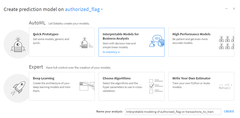
To utilize this auto-prediction modeling, the analyst provides the name of the column in the dataset that contains the target variable. After that, Dataiku does the rest. It automatically determines which kind of data is contained in each column (categorical or continuous) and makes decisions about model parameters. The user can simply select TRAIN and off they go!
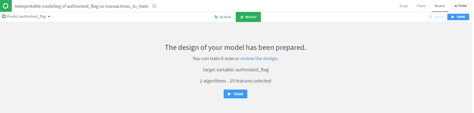
Now, as you might expect, it is always a good idea to check the decisions that Dataiku has made on the user’s behalf. Even though no-code tools offer quick paths to AI, we still need to follow responsible AI practices. Therefore, we highly recommend that they select review the design as seen above. When reviewing the design, here are the most important things to check:
Features Handling
This is part of the design that an analyst should take time to check. There are three aspects of Features Handling that need attention.
1. Which Variables to Include
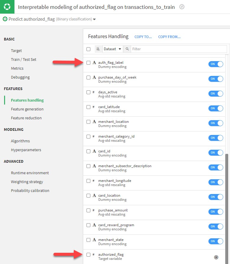
Dataiku will lean toward using move variables vs. using fewer. Because a user knows their data well, they are better positioned to make the determination of which columns to include.
In this example, Dataiku selected most columns in the dataset to be used in the model. In particular, it chose to include auth_flag_label. A user would know that this is the string version of the target variable, authorized_flag and to include it would lead to data leakage which would erroneously inflate the model’s predictability. It’s simple to toggle it from ON to OFF, but it will make a huge difference in the outcome of the model and the insights that can be gleaned from it.
2. Dummy Encoding of Categorial Variables
This is important, especially for analysts who are building regression models that will be used to explain the target variable. If an analyst wishes to utilize the coefficients provided by the regression models, they need to understand this behavior in Dataiku.
For each categorical variable, Dataiku offers options on how to handle dummy encoding. Dummy encoding is the process by which each value in a category gets its own column in the data with values of 1 (true) or 0 (false). This is how algorithms convert text variables into numeric and therefore usable in a mathematical model.
The choices for Dummy encoding are these:
- Let DSS [Dataiku] decide (default)
- Don’t drop
- Drop one dummy
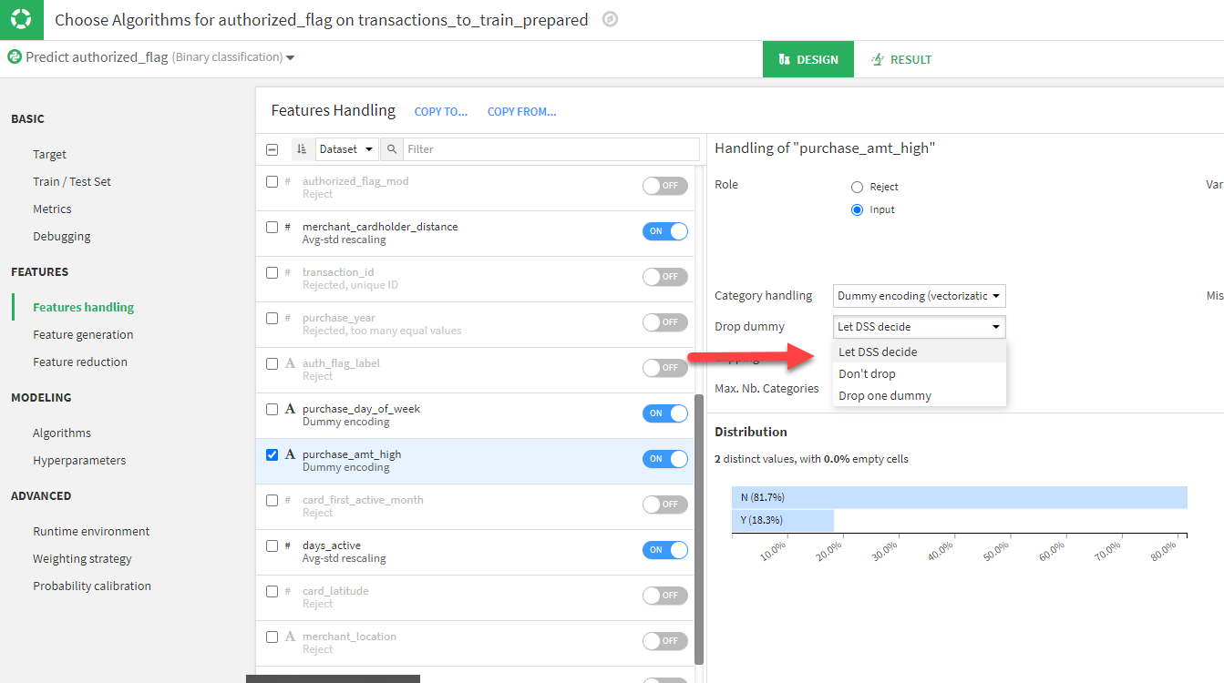
Sometimes Dataiku will decide to drop one dummy. This means that if you have a categorical variable with two values, say true and false, Dataiku will only include one of these columns in the model. If you select Don’t drop this forces Dataiku to include both columns in the model.
If all of the dummy columns are included in the model, there will be explicit coefficients for each one. If one of the dummy variables is not included, the impact of that variable will show up in the Intercept. This will change how the analyst will interpret and report the influence of these factors on the target.
Here’s an example. Here we are showing the coefficients of the logistic regression model. The column purchase_amt_high is a column with values of either Y or N. In this model, we let DSS decide how to encode the dummy variable and it chose to drop one dummy. The effect is that we only see purchase_amt_high is N as a factor and the impact of purchase_amt_high is Y is included in the Intercept. Here, the coefficient for purchase_amt_high is N is 0.1672 and the Intercept is -0.2639.
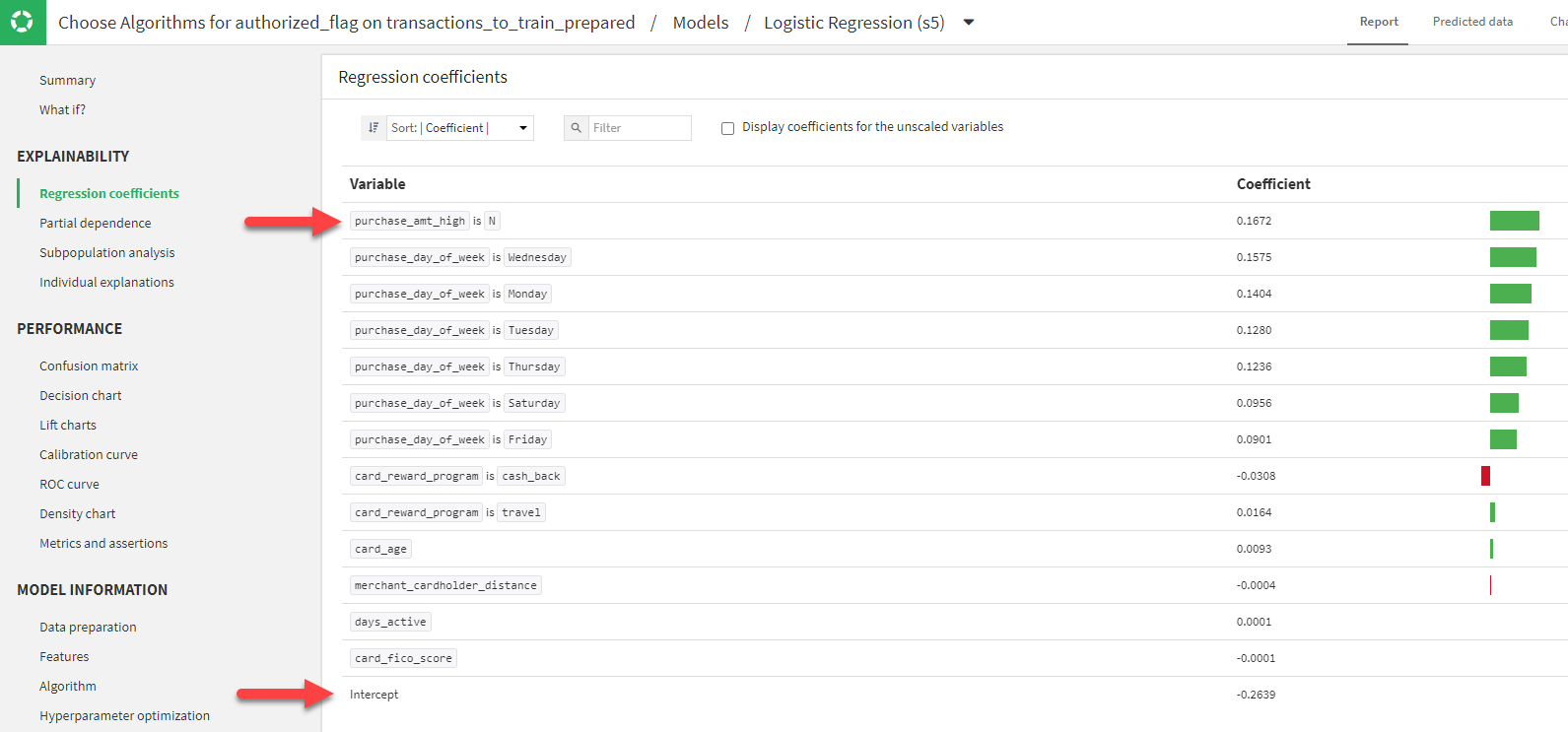
We went back to the design and changed the dummy encoding option on this variable to be Don’t drop. Now we can see that both purchase_amt_high is N and purchase_amt_high is Y appear as variables. Now the coefficient for purchase_amt_high is N is 0.0451 and the Intercept is -0.1418. Note that the difference between the Intercept of the first model and the second model is -0.1221, which is now the coefficient of purchase_amt_high is Y. Also, the coefficient for purchase_amt_high is N dropped by 0.1221.

Dummy variables are always handled correctly by Dataiku, but an analyst’s interpretation of the model’s coefficients is dependent upon how they were treated in design. It is vital for an analyst to be in control of dummy encoding if they wish to properly interpret the output of their regression models.
3. Missing Values
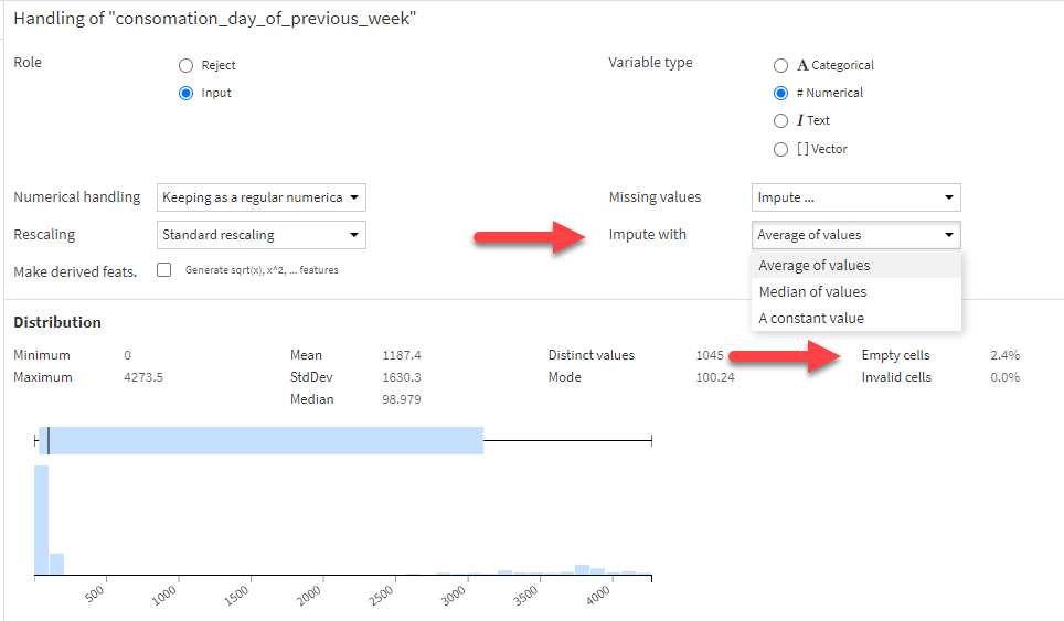
The last – but still very important – setting to check in Features Handling is the method of dealing with missing values in the data. The process of filling in empty values is called imputation. In Dataiku, an analyst can first choose to either drop empty rows or to impute a missing value. If imputation is chosen, they can then choose between these methods:
- Average of values
- Median of values
- A constant value (such as 0)
The default choice of Dataiku is to impute missing values with the average.
The implications of this are clear for business analysts. Sometimes an empty value is simply null and providing any value doesn’t make sense. Using a constant such as 0 might work well, or sometimes using the average or the median could also make sense. But in each case, for each column, this decision needs to be managed by the analyst.
In the example below, you can see that Dataiku provides the percentage of cells that are empty so analysts can better understand the implications of their choice.
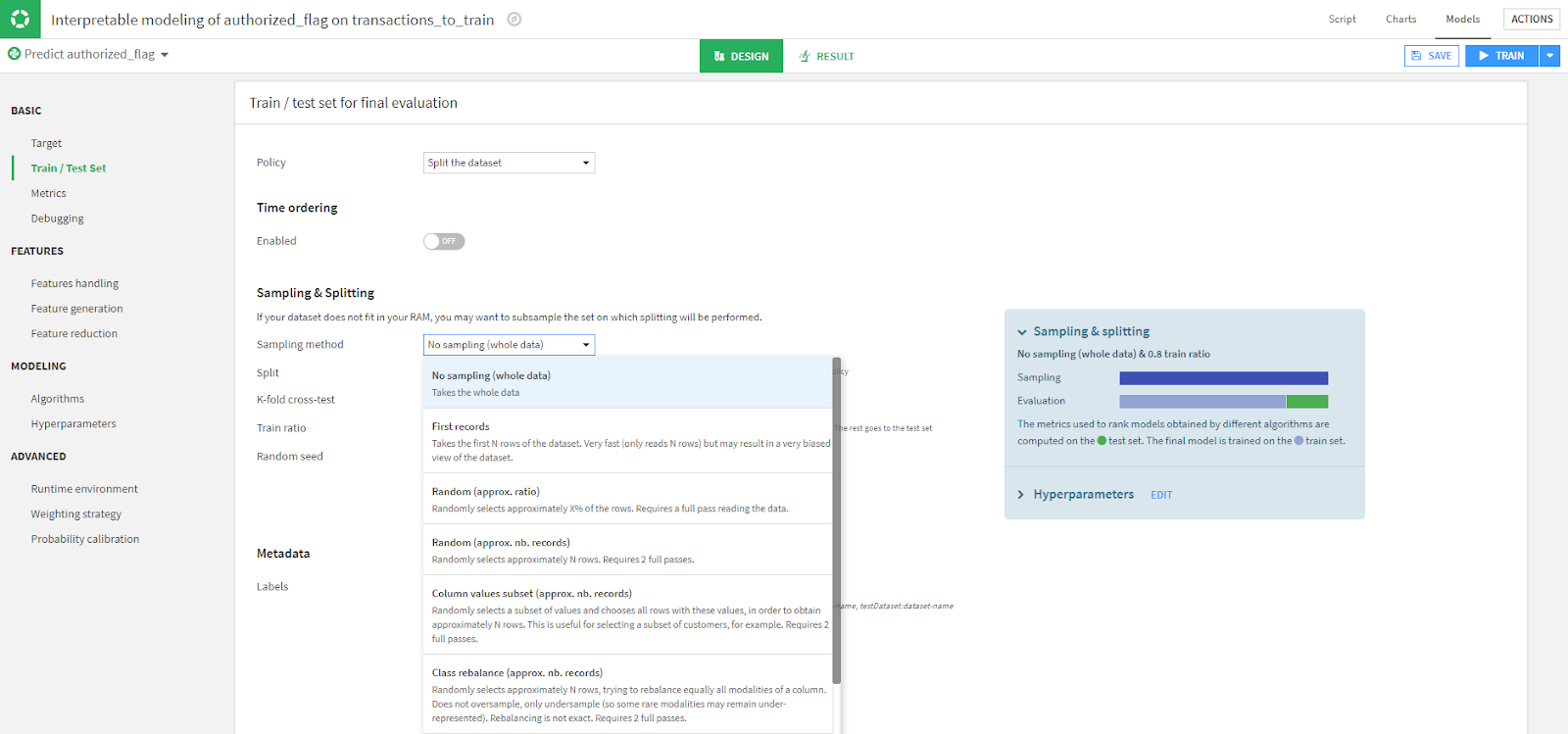
Train Set Sampling Method
Besides Features Handling, another important setting to check is the Train set sampling method found in "Train/Test Set" under "Basic". Dataiku by default will select a sample of the dataset. If you want to be sure to include all records, change the Sampling method setting to use No sampling (whole data).
Algorithm Selection
As mentioned, Datiku will pick algorithms for you, but if there are specific models you are familiar with, by all means, use them. You can make those selections in the "Modeling" under "Algorithms".

Get Ready to Transform Your Data Into Actionable Insights
Whether you’re a coder or non-coder, it is hard work to ingest and transform data from disparate sources to meaningful, actionable insights. While there is no magic to do the work for you, a no-code tool like Dataiku can make many tasks that are laborious (or impossible) in Excel achievable and allow for automation of analytics processes as well.
For a business analyst willing to learn, Dataiku can improve both the velocity and the quality of their insight creation. So here’s to the perfect match between business analysts and no-code data science software! May they live happily ever after!
| FEATURED AUTHOR: SHELLY KUNKLE, SENIOR DATA CONSULTANT
-1.png?width=290&name=Blank-Template-Facebook-Post%20(2)-1.png)